 This month we are studying Claude Monet and doing our own rendition of his Water Lilies in Chalk Pastel.
Join us in learning about the life of this fascinating artist, and a little bit about how to create a beautiful piece of art similar to his famous work. This lesson is suitable for children age 8 and up!
Learn about Monet’s life and Impressionism
This Wikipedia Article Includes lots of information about Monet’s experiences and a number of paintings to view and become familiar with Impressionism and Monet’s style.
Now, its time to create your own water lilies picture.
First gather your supplies-
Chalk Pastels at least 24 colors
Construction paper in green or blue
Paper towels to clean your hands and pick up any excess chalk dust
Magic Erasers For those little oops
Fixative so your picture doesnt smear and get rubbed off although for our purpoes hair spray works just as well
Now follow along as we make our water lilies 🙂
 Here are our supplies ready to go. :) You can see our chalk pastels are well used. Don’t worry if they become broken… sometimes they are easier to use that way. If they become dirty from the dust of the other colors, just use your paper towel to rub the dust off– same with the erasers.
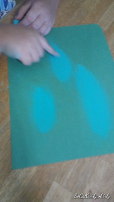
When you look at a flat circle like a lily pad from an angle it looks like an oval, so the first step is to choose a medium green and make some small ovals grouped up on  one side of your paper.
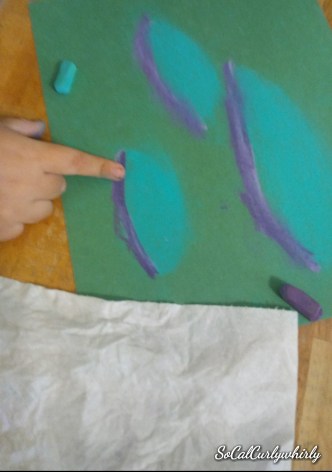
You can make smaller circles or you can go bigger for a more close up effect. As you can see in this sample picture I made.
Lil Dude chose to do larger water lilies. After you color them in a bit, use your finger and blend the color into a nice green. And in the picture below you can see Lil Diva making smaller water lilies. As you blend the colors, make sure to wipe your fingers on your paper towel or you may get finger prints on your paper that are unwanted– or on your nose!
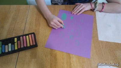
The next step is to add a darker color at the bottom of each water lily to show the shadow. On the purple paper I used a dark purple, but a dark blue would like good too.
 Don’t worry about making everything perfect. Impressionism, the style used by Monet, isn’t about making a photo like representation of the scene, but rather about capturing the light, and the feeling of a scene.
 Continue to blend the colors making sure to have soft transitions between the colors. The next step is to add a lighter green highlight to the top of each water lily where the sun touches them. Blend your colors well and enjoy how it makes the lilies look round and real.
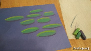
Next using white make a flower next to, or on top of one of your lilies.
 You can use a little pale yellow and pale pink to give a little depth to your flower, just blend it in well with your finger.


Next add blues to make the water. Straight lines going across the page will create a look of water reflecting the light, then blend the colors well so you don’t seen individual lines standing out. Use darker blues under the lilies to show shadows, and lighter blues to show where the sun is reflecting off the water.
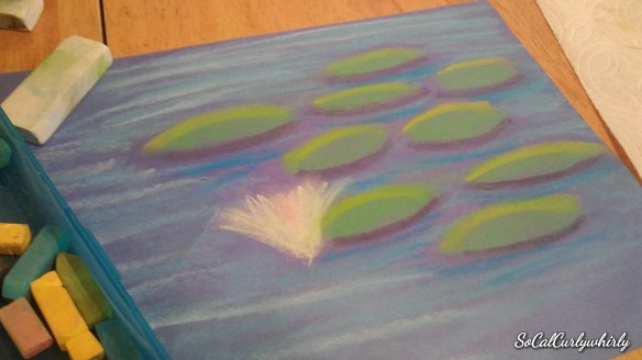
And here is my final picture! When I’m satisfied with my picture I spray it lightly with fixative so it doesn’t smear, or I keep it covered with another scratch paper until I get the fixative.
This quick lesson teaches many things– blending, light, and even a little bit of perspective.
If you try it, I would love to see your projects! Please post them in the comments or send me a private message. I would love to hear from you!
